All that matters..

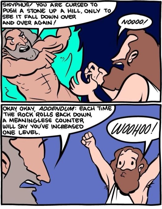
Sisyphus


Pretty awesome huh?

It is funny how all that matters in many products is the feeling of progress.. the feeling of leveling up. It doesn’t have to actually mean anything. It just needs to feel meaningful.

And the best way to indicate progress is a number:

  • Your like count
  • Your follower count
  • Your karma score
  • Your experience points
  • …whatever…

Gamification baby!

Now, please don’t mind me. I’m going to hit the publish button, and see if the follower count goes up on this blog 😉

Minimizing cognitive load in design

brain

Yesterday, I wrote on the three things I believe to be important in design.

I’d like to delve a little more into minimizing cognitive load. It sounds like a simple statement, but actually means a lot.

Minimizing cognitive load means that you respect the user’s time and attention. They are using your product to get something done, and you want to enable them to do it with as little extra mental processing as possible.

Minimizing cognitive load means reducing extraneous clutter. Clutter makes a page difficult to process. The user must filter through several bits of information before finding what really matters to them.

Similar to clutter, minimizing cognitive load means reducing distractions. The unfortunate part is that for most websites on the internet, ads count as clutter. They provide little value and act as something the user must dodge.

Minimizing cognitive load involves an understanding of the user’s attention and focus. At any given point, what are they trying to do? How do you make it as easy as possible for them to accomplish this? This requires a great deal of empathy for the user.

Minimizing cognitive load involves an understanding of the user’s habits and behaviors. Are there common behaviors performed by the user? What are the most important things your user does? What patterns of behaviors do your users have? How do you design in order to make these behaviors as streamlined as possible for your user?

Minimizing cognitive load tends to imply simplicity. Distilling a product to its core concepts makes it easier for the user to figure out what is going on. However, don’t over simplify. A product which is over simplified can be confusing and difficult to figure out.

Can you think of anything else? The more I think about design, the more I believe that enabling the user while minimizing cognitive load is one of the most difficult parts of design. If you know of any good resources or tips, I would love to hear them.

P.S. This is post number #84 in a 100 day blogging challenge. See you tomorrow!

Follow me on Twitter @alexshye.

Or, check out my current project Soulmix.

Good design

Apple Macbook Air

I’m not artist or designer, but I have spent enough time studying good products on the web (as well as studying why my past products have sucked) to have some initial thoughts on it.

From my limited experience, design can be boiled down to three main points.

  1. Good design is useful. It enables the user to easily do what they want to do.
  2. Good design minimizes cognitive load. It respects the user’s time and attention.
  3. Good design is beautiful, without sacrificing utility or increasing cognitive load.

Only three things, but it is difficult to accomplish all three. If you product is useful, minimizes cognitive load, and is beautiful, you have done one hell of a job.

What does good design mean to you?

P.S. This is post number #83 in a 100 day blogging challenge. See you tomorrow!

Follow me on Twitter @alexshye.

Or, check out my current project Soulmix.

Consumer web: focus on two concepts

Following the last post on how life is simple, it has been starting to dawn on me that consumer web design is also simple.

I don’t mean it is simple to think of something and get traction. I just mean simple in design.

This is for good reason.

When a new user reaches a website, everything is new. If you do a good job with design, and if the user is interested, they might learn a few concepts.

Sites with one concept seem to be rare. You should hope to get across at least two concepts. The two concepts needed usually turn out to be (1) a data format, and (2) an interaction with respect to the data.

Here are some examples of early products:

  • Twitter: tweets, and follows
  • Reddit: posts, upvotes
  • WordPress: blog posts, follows
  • Tumblr: blog posts, and reblogs (follows could be a third)
  • Myspace/Facebook: profiles, and friending (the wall messages is a third)
  • Pinterest: Pins and repins (with board, and maybe follows)
  • Yelp: Places and comments
  • Instagram: Picture art, and share
  • Snapchat: Picture art, and temporary share

Pay attention to your product’s data format and main interaction. It seems that these concepts define what your product will fundamentally become. If you can’t get the site off the ground with these concepts, you may not have a good product. If you find yourself white-boarding or coding something with more concepts, you might want to reconsider.

A good number of startups in the short list above seem to have something that could be considered a third concept. If you have one, it should add a lot to your product. For example, people love to curate boards on Pinterest. Writing on Facebook walls were pretty popular back in the days.

Also, from the inconclusive list above, it seems like each combination of concepts ultimately becomes dominated by the one startup that executes it well. By dominating, I mean that this startup is usually serves the general user well and covers many (if not all) niches.

Be sure to clearly define your few concepts. If they are the same as another startup (particularly one who is winning already), be careful. You probably don’t want to clone it unless you have a good idea of how you are going to be different. It could be execution. Facebook beat Myspace because of how its execution influenced the community. It could be tweaking the product. As Andrew Chen says, it may be good to clone 80% of a startup as long as you tweak 20% of the product. One way is to tweak one of the concepts in a fundamental way so that your product changes. This would be the best. A second is to cater to a particular niche and add product features for that niche. If you do this, you can still succeed, but you most likely will never get as big as the main startup that dominates your combination of concepts.

In general, this is good news for consumer web product designers. Keep it simple, and focus on your two (or three) fundamental concepts.

How do you think about consumer web products? Simplifying consumer products has helped me begin reasoning about different products. I would love to hear your thoughts.

P.S. This is post number #34 in a 100 day blogging challenge. See you tomorrow!

Follow me on Twitter @alexshye.

Do you like to ponder life? You might like Soulmix.